Takeda needed more than just an awareness campaign, they needed a tangible engine for change. I was tasked with branding and launching the initiative to accelerate the inclusion of people with disabilities (PwD) within the company.
I created The Brighter Futures Program, a hybrid movement blending internal education with real, systemic action. By mixing internal awareness with actionable steps, I built a scalable campaign that aim to transform company culture first, with the power to expand externally.
CLIENT
Takeda
Agency: Intent Health
ROLE
Senior Art Director
SERVICES
Brand Naming & Narrative
Visual Identity System
Integrated Internal Campaign
Open to Work. Ready to Shine.
We all recognize the green "Open to Work" halo on LinkedIn. It is a universal digital signal of readiness, ambition, and availability. But for people with disabilities, simply being "open to work" is often not enough when the doors of the corporate world remain stubbornly closed.
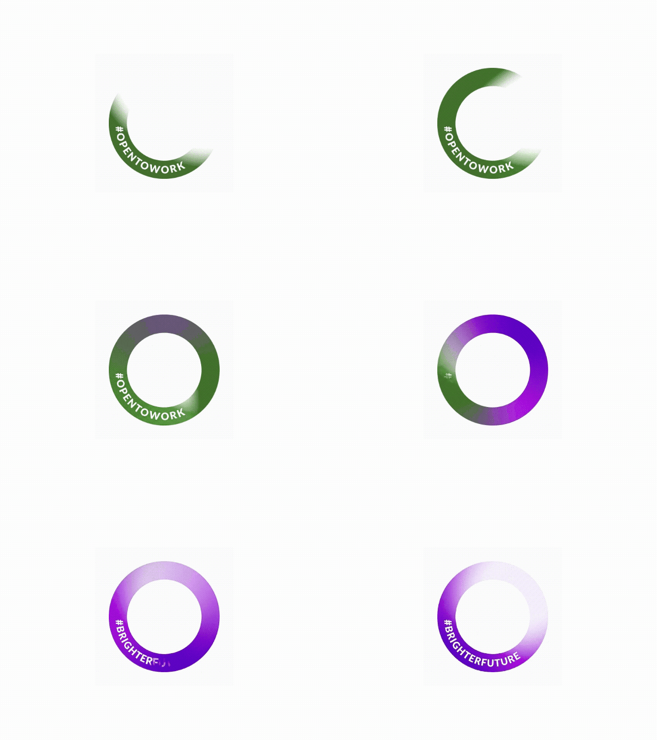
It is time to shift the focus. For Takeda's Brighter Futures Program, we wanted to take the concept of the employment "halo" and turn it into a literal spotlight. We aren't just joining the conversation, we are creating a new standard. We replaced the standard green networking badge with our own label: #BrighterFuture.
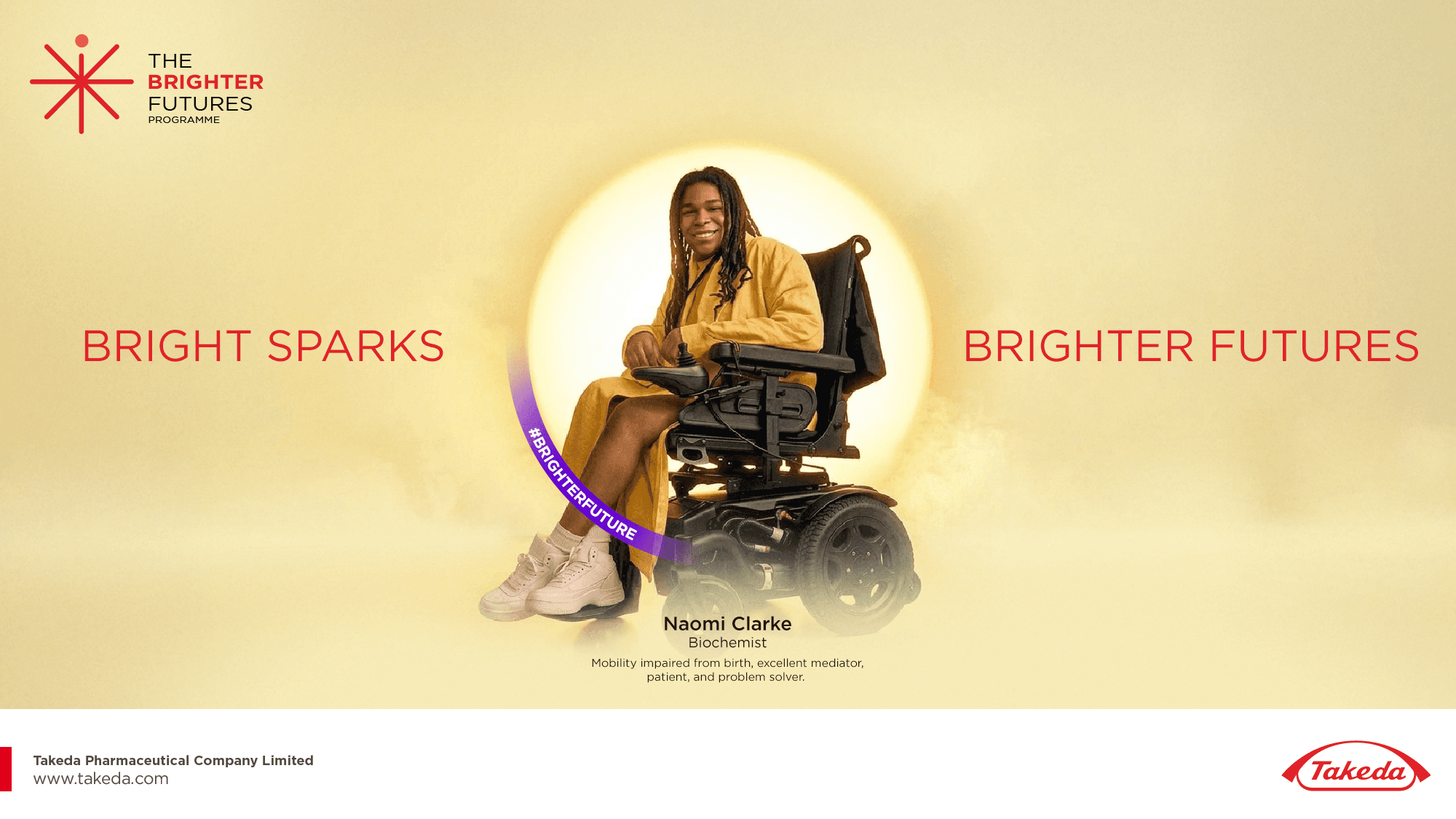
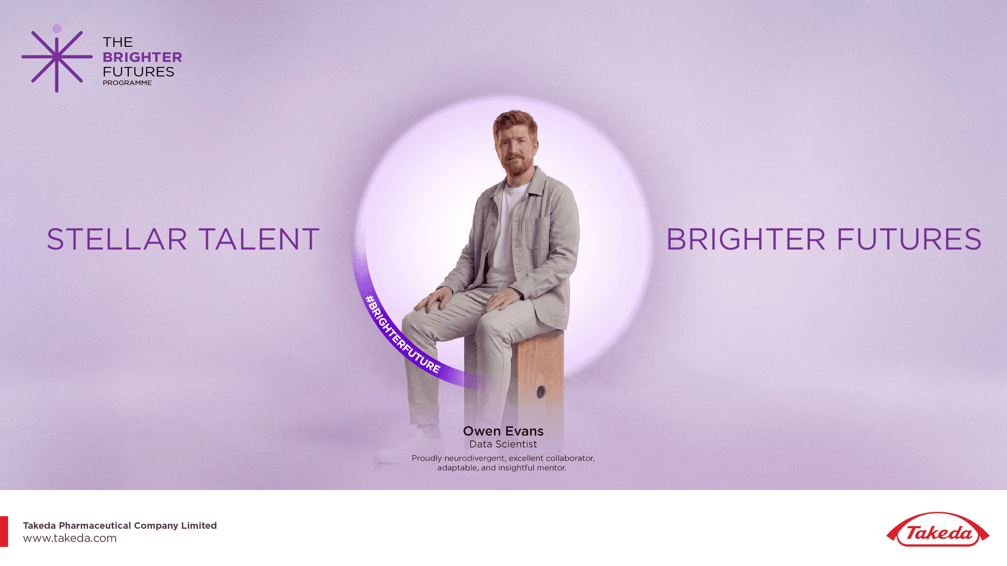
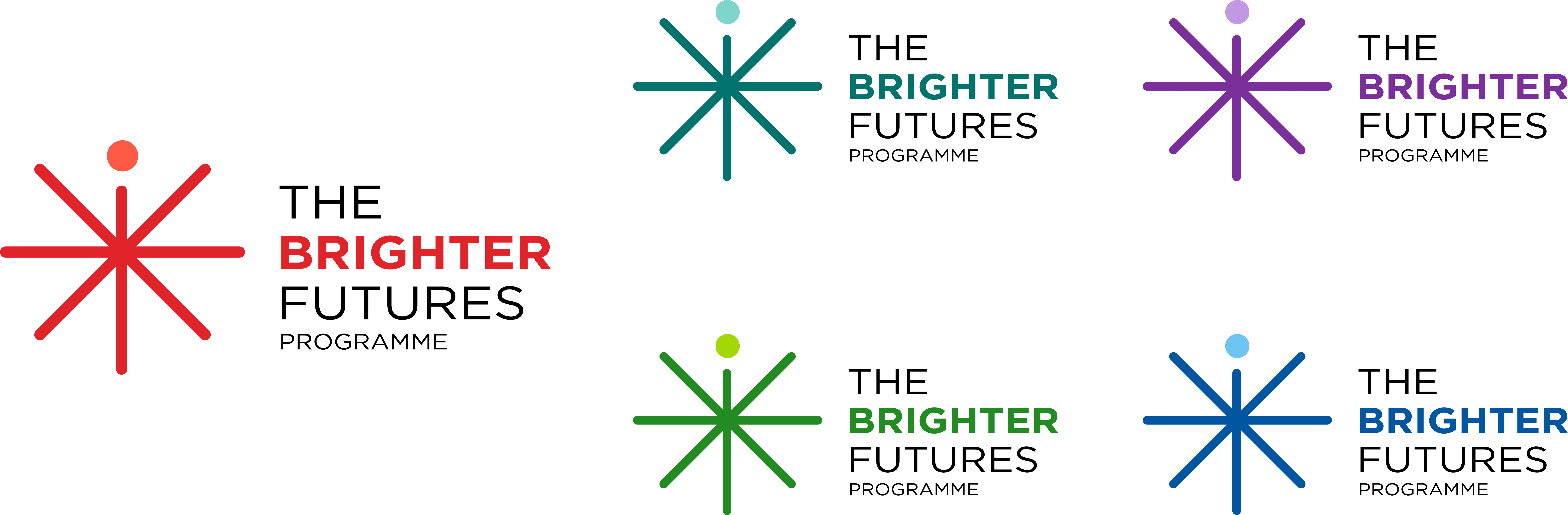
I created a dynamic, "living" symbol that doubles as a radiant spark and an abstract human figure. Designed with variable line lengths that continuously shift and adapt, the logo visually embodies the reality that exceptional talent does not fit into a single, uniform mold.


Smooth Scroll
This will hide itself!
This will hide itself!